コマンドプロンプトか Windows Power Shell を起動して以下のコマンドを入力するだけでインストールは完了します.
pip install numpy
pip install matplotlib
matplotlib とは Python で図を描画するためのライブラリです.機能が豊富で,さまざまな図の描画が可能ですが,今回は簡単なグラフの描画に限定して説明していきます.最近では Matplotlib よりも洗練された多機能のライブラリもあるようですが,定番と言えば Matplotlib なので,これを扱っていきましょう.
- グラフ作成の仕組み
- 流儀
- グラフ描画の基本
- リストデータのグラフ化
- プロットの点や線の指定
- 座標軸のラベル
- 凡例とキャプションの付与
matplotlib では最初にグラフの枠組みとなる描画領域などのオブジェクトを生成し,続いてオブジェクトの要素であるグラフの線や凡例などを追加していくという仕組みになっています.
枠組みとしてのオブジェクトには枠組みとしての Figure,グラフ描画部分を表す Axes そして軸などの Axis があります.
ややこしいことに matplotlib でグラフを描画するのに2つの流儀があります.どちらでもグラフの描画が可能です.一つは「オブジェクト指向スタイル」でもう一つが「MATLAB流」です.MATLAB経験者にとってはMATLAB風が良いのかもしれませんが,この授業ではオブジェクト指向のスタイルで説明していきます.
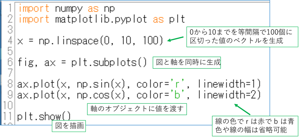
とりあえず感触を試すために,基本的な関数である sin x と cos x のグラフを作ってみましょう.numpy がすでにインストールされているので,以下のスクリプトを実行してみてください.
import numpy as np import matplotlib.pyplot as plt x = np.linspace(0, 10, 100) fig, ax = plt.subplots() ax.plot(x, np.sin(x), color='r', linewidth=1) ax.plot(x, np.cos(x), color='b', linewidth=2) plt.show() |
実行すると,以下のような画面が表示されると思います.
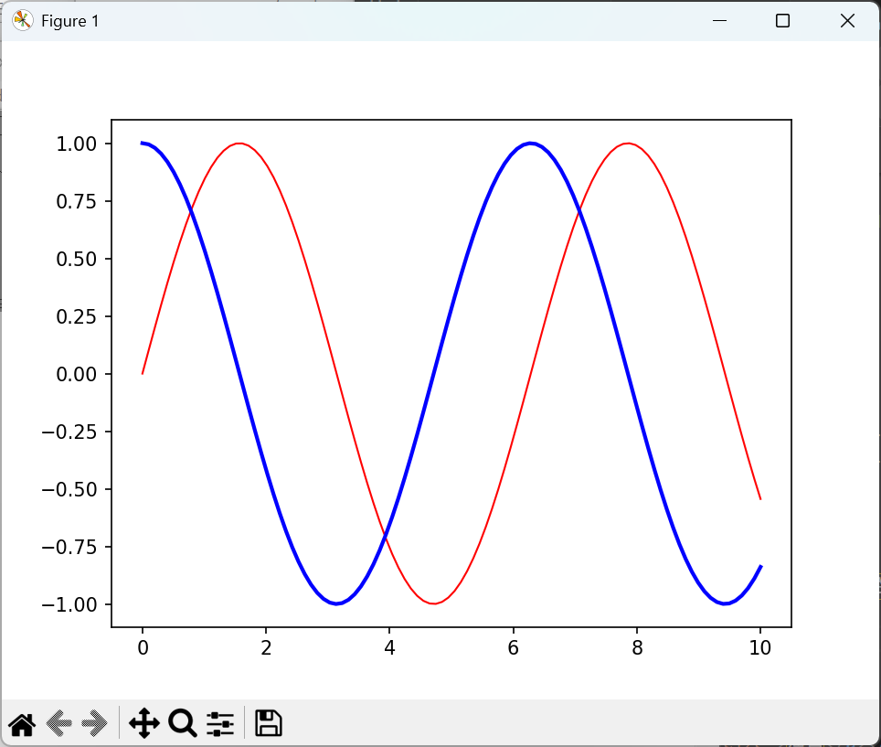
まず import 文ですが,numpy は略称として np を使用し,matplotlib は plt を使うということがお約束ですので,そこは勝手な名前にはしないでください.その他の説明は下図のようになります.
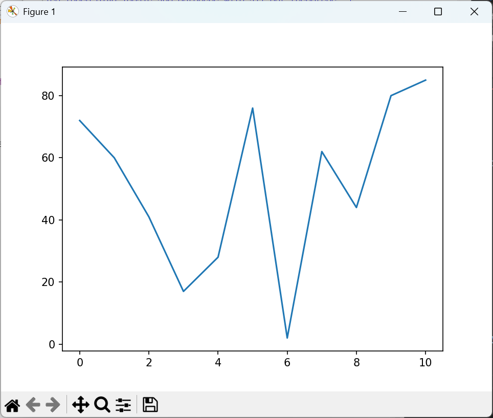
リストの内容をグラフにするためには,特に難しいことをする必要はありません.以下のようにプロットさせるだけです.
import matplotlib.pyplot as plt from random import * xlst = [i for i in range(11)] ylst = [randint(1, 100) for _ in range(11)] print(*ylst) fig, ax = plt.subplots() ax.plot(xlst, ylst) plt.show() |
72 60 41 17 28 76 2 62 44 80 85 |
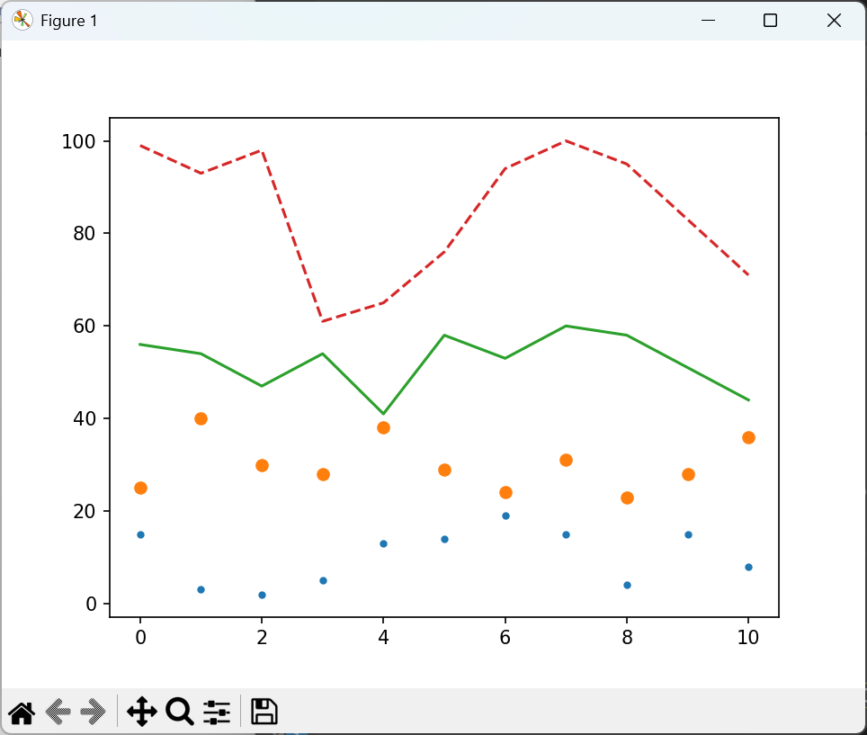
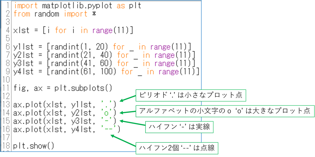
プロット点なども以下のように指定することで変更できます.
import matplotlib.pyplot as plt from random import * xlst = [i for i in range(11)] y1lst = [randint(1, 20) for _ in range(11)] y2lst = [randint(21, 40) for _ in range(11)] y3lst = [randint(41, 60) for _ in range(11)] y4lst = [randint(61, 100) for _ in range(11)] fig, ax = plt.subplots() ax.plot(xlst, y1lst, '.') ax.plot(xlst, y2lst, 'o') ax.plot(xlst, y3lst, '-') ax.plot(xlst, y4lst, '--') plt.show() |
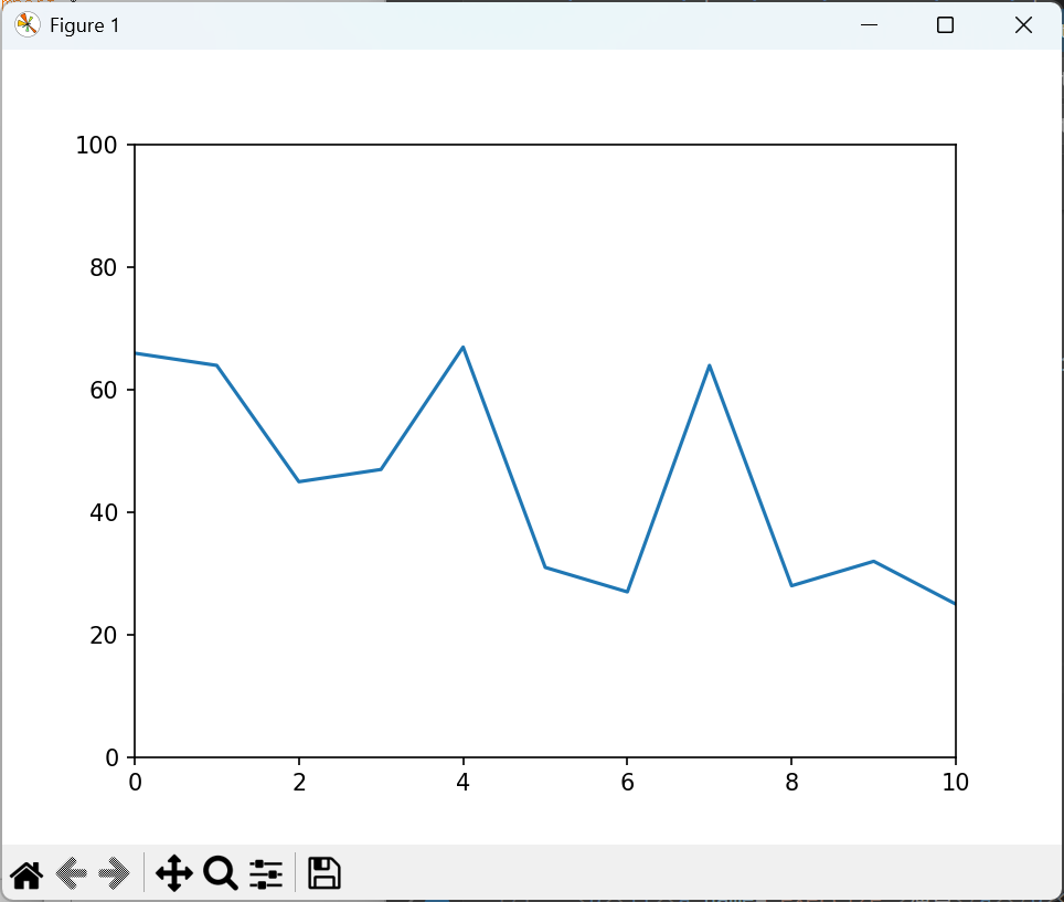
matplotlib ではグラフに描画する座標データに応じて縦軸と横軸の数値を自動で割り当ててくれます.自分で値を固定値にすることも可能です.
import matplotlib.pyplot as plt from random import * xlst = [i for i in range(11)] ylst = [randint(21, 80) for _ in range(11)] print(*ylst) fig, ax = plt.subplots() ax.set_ylim(0, 100) ax.set_xlim(0, 10) ax.plot(xlst, ylst) plt.show() |
グラフを描く際には縦軸と横軸の物理量が何なのかを必ず書くことになっています.そこで,グラフに凡例と量を説明するキャプションを入れましょう.
import numpy as np
import matplotlib.pyplot as plt

x = np.linspace(0, 10, 100)

fig, ax = plt.subplots()

ax.plot(x, np.sin(x), label='sin x')
ax.plot(x, np.cos(x), label='cos x')
ax.set_xlabel('x')
ax.set_ylabel('sin x, cos x')
ax.set_xlim(0, 10)
ax.set_ylim(-1.5,1.5)
ax.grid()

plt.legend()
plt.show()
|
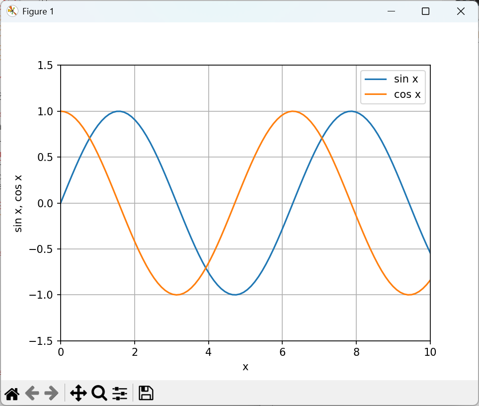
上の結果のグラフのように,今回軸のキャプション,凡例,そしてグリッドを追加しました.
CSV ファイルからグラフを作成することも行ってみましょう.上の III の v. の作業を一度 CSV ファイルに保存してから読み出して作業するものに変更します.
import matplotlib.pyplot as plt
from random import *
from csv import *

xlst = [i for i in range(11)]

y1lst = [randint(1, 20) for _ in range(11)]
y2lst = [randint(21, 40) for _ in range(11)]
y3lst = [randint(41, 60) for _ in range(11)]
y4lst = [randint(61, 100) for _ in range(11)]

ylst = [y1lst, y2lst, y3lst, y4lst]

with open('plotdata.csv', 'w', newline = '') as f:
    data = writer(f)
    data.writerows(ylst)

f.close

with open('plotdata.csv', 'r') as f:
    data = reader(f)
    txtdata = [txt for txt in data]

f.close

numlst = [[int(txtdata[i][j]) for j in range(11)] for i in range(4)]

fig, ax = plt.subplots()

ax.plot(xlst, numlst[0], '.')
ax.plot(xlst, numlst[1], 'o')
ax.plot(xlst, numlst[2], '-')
ax.plot(xlst, numlst[3], '--')

plt.show()
|
本日の最後の取り組みはリアルタイムでグラフを表示するものです.データ計測においては必須の機能ということになります.while 文の中で乱数を発生させ,その都度グラフに描画するということを試してみましょう.matplotlib の animation 機能を使用します.
from time import *
from random import *
from matplotlib import pyplot as plt
from matplotlib import animation
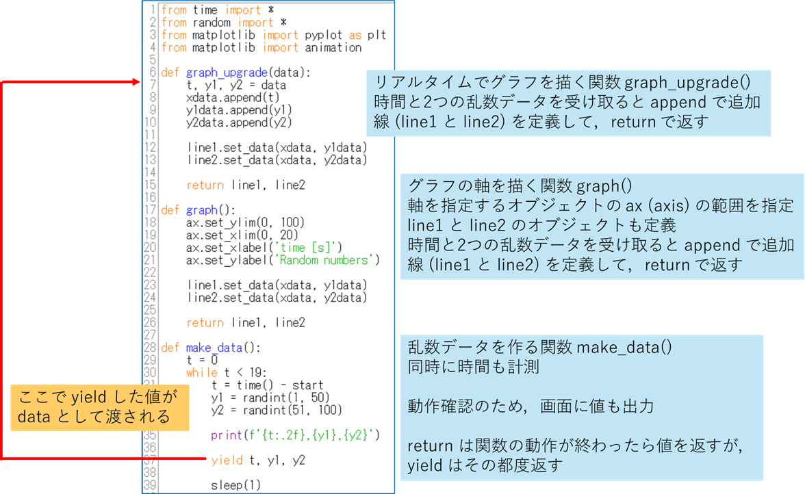
def graph_upgrade(data):
t, y1, y2 = data
xdata.append(t)
y1data.append(y1)
y2data.append(y2)
line1.set_data(xdata, y1data)
line2.set_data(xdata, y2data)
return line1, line2
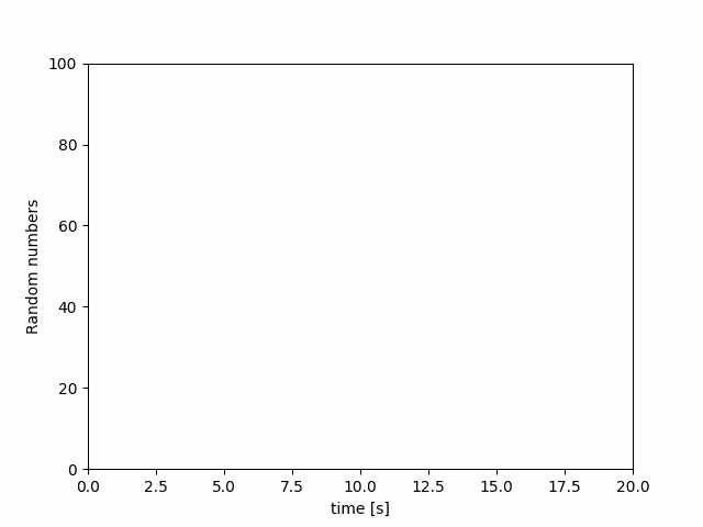
def graph():
ax.set_ylim(0, 100)
ax.set_xlim(0, 20)
ax.set_xlabel('time [s]')
ax.set_ylabel('Random numbers')
line1.set_data(xdata, y1data)
line2.set_data(xdata, y2data)
return line1, line2
def make_data():
t = 0
while t < 19:
t = time() - start
y1 = randint(1, 50)
y2 = randint(51, 100)
print(f'{t:.2f},{y1},{y2}')
yield t, y1, y2
sleep(1)
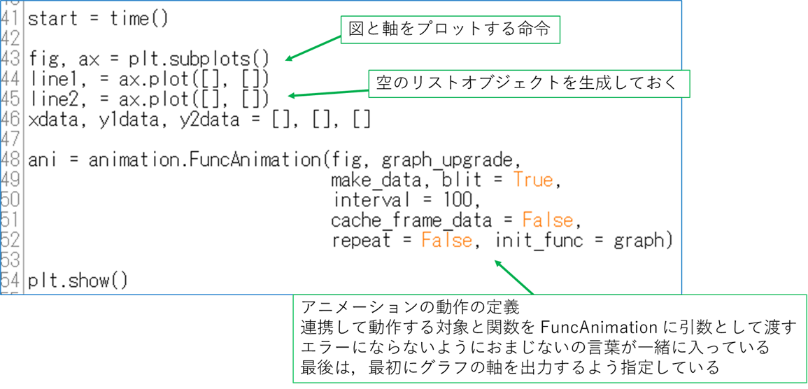
start = time()
fig, ax = plt.subplots()
line1, = ax.plot([], [])
line2, = ax.plot([], [])
xdata, y1data, y2data = [], [], []
ani = animation.FuncAnimation(fig, graph_upgrade,
make_data, blit = True,
interval = 100,
cache_frame_data = False,
repeat = False, init_func = graph)
plt.show()
|
定義する関数は以下の3つになります.
- リアルタイムでグラフを描く関数 graph_upgrade
- グラフの軸を決める関数 graph
- 乱数を作る関数 make_data
0.17,31,80 1.21,9,99 2.24,35,89 3.27,17,61 4.30,50,52 5.32,11,85 6.35,7,52 7.37,35,56 8.41,4,71 9.44,39,85 10.47,50,81 11.50,16,73 12.52,29,65 13.55,33,69 14.57,15,95 15.60,1,65 16.64,7,76 17.67,35,67 18.69,11,52 19.73,12,61 21.18,16,74 |